

So you’ve decided to set up your own business. You’ve chosen your business name. Whats next? Well that would be your logo. Not everyone has a big budget for a logo, but that doesn’t mean that you can’t still have a great logo designed.
In this blog I’m going to discuss the following:
- What is a Logo?
- What makes a good Logo and why do I need one?
- The elements of a Logo
- The context in which Logos are used
- Logo Rebranding – keeping up with the times
What is a Logo?
A Logo is the signature mark of a company. Either icon or text based it is there to allow clients to recognise the unique identity of that brand. People recognise and relate to imagery much quicker and better than text. So a Logo must be memorable, relevant and unique to the companies industry.
Logos usually consists of an icon or brandmark and type, and sometimes (but not always necessary) a tagline.
What makes a good Logo and why do I need one?
A good Logo creates the foundation of a brand and will help you to stand out from the competition. It will also communicate with customers about the industry you exist in, the services you offer and will target your demographic – ultimately bringing you in the sweet sweet sales that you need!
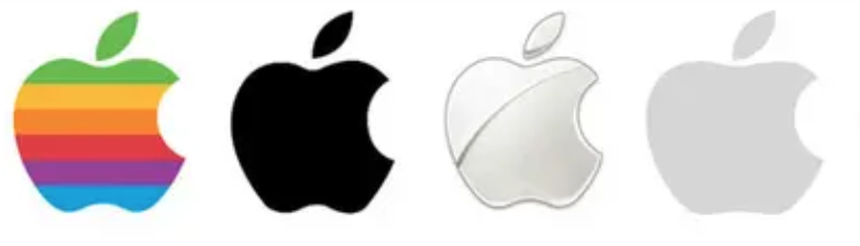
Great Logos will leave a visual impact that will be unforgettable and remind your customers that you exist. Think of companies such as Apple, who’s simple apple brandmark is ingrained into all of our memories. We don’t even need to see the company name to know who they are.
This is why it is important to work with a designer to create your Logo and brand identity. They will create a Logo that will be impactful and memorable whilst targeting the customers you want.
The elements of a Logo
Typography
Most logos will have some kind of typography within them. This could range from a full name, an abbreviation or even a single letter. Usually a logo will use one or two fonts, or alternatively will be custom lettering. In most cases, If a font appears in a logo then it is normally used in other branding and marketing materials to keep consistency. This is known as a Brand Font.
Imagery
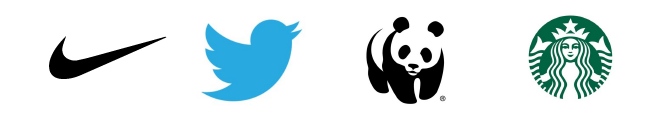
Imagery within a logo can appear in a few ways. Sometimes a logo can just be a symbol/brandmark or it can be accompanied with some typography. Normally a brand mark will be a simple icon that works in one colour as well as a few. It can be abstract, geometric or just representative. But in most cases, simplicity is key.
Colour
Black and white, single colour, multicolour and monochrome. There are many different ways to design a Logo.
Multicoloured logos tend to stick to a limited palette, which is continued throughout all branding. These become the primary brand colours. When designing a multicolour logo, I tend to recommend the use of no more than four colours (not including black).
I also am a firm believer that a multicolour logo should work in monochrome as well. For example, if you wanted to have your logo embroidered on to some work shirts, it is more cost effective to stick to one colour.
When selecting the colours for your brand it is important to also understand the psychology of colour and how different colours can impact the consumers impression of the brand. Check out this article for some interesting information on colour psychology and how to use it.
The context in which a Logo is used
Logos are used everywhere, below are a few examples of where a brand will use their logo.
- Website
- Social Media
- Business cards and business stationery
- Marketing materials
- Packaging
- Signage
- Merchandise
- Uniforms
- and more!
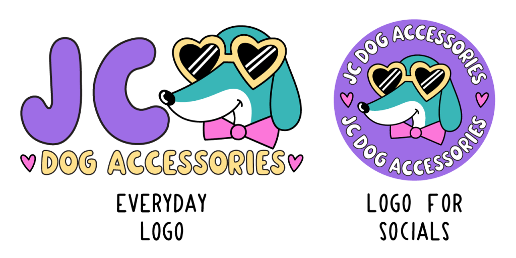
The context in which a logo will be used can also affect the design of it. If a company is predominantly an online business with social media presence then their logo will need to work perfectly inside those little circular profile pictures.
A logo that works well within a circle can be more ideal than an oblong rectangular logo. In some cases just the brandmark can be used within a profile picture. A good designer will consider these factors whilst designing. They may even suggest having two logos, an everyday logo and one specifically for your socials
Rebranding: Updating Logos to keep up with the times
As companies grow and develop in an ever changing world they often find that their Logo may feel like it no longer represents their business or services. So to keep up with the times, companies will update their Logo and branding. Sometimes this can be a subtle change or it can end up as a completely new and different aesthetic.
Pepsi-Cola are a great example of a world wide brand that have regularly updated their Logo with the times.

As you can see at each stage the Logo has taken elements of the previous iteration and developed into something new but still familiar. These subtle changes allow Pepsi’s customers to continue to recognise the brand and allow Pepsi to keep up with the times.
To conclude:
A Logo is the visual identity of a company that helps to build long standing brand recognition with its customers whilst allowing the business to stand out against its competition. Logos can come in a variety of styles, whether text based or icon based or an integration of the two. As times change a company will often update or “rebrand” their Logo allowing them to connect with new and retain existing customers.
Graphic designers are trained in understanding the art of Logo design and will create a Logo that will be the perfect fit for your business.
If you would like to work with me on a Logo design feel free to check out my work and get in touch!

